I will address three elements of design here, namely: line (including 5 examples), pattern (5 examples) and texture (5 examples).
Line: Lines give a sense of direction to a design, creates movement in a design, breaks larger areas into smaller ones, and carry your eye from one area to another (Liddell and Samuels, 2008, p. 206).
1. Vertical Lines
Distinctively Canadian – The uniform of the RCMP - The Red Serge.
Use of Line: A wide yellow band of line down the blue breeches provides contrast and identifies the cavalry history. This is an example of how a vertical line can create an emphasis visually on a garment, in this case, a special occasion uniform (breeches – the balloon shaped pants) to create a distinctive mark – a yellow line. Vertical lines give the feeling height, strength, and dignity (Liddell and Samuels, 2008, p206) – hence, appropriate use of line for the police!
2. Horizontal Lines:
This sample below is a typical horizontal line in a repeated pattern. This swatch is a wool blend that is well suited for throw pillows and upholstery. Horizontal lines can be used effectively as a contrast to a solid color in furniture to bring out and add a pop of color contrast. Horizontal lines evoke a feeling of calm and relaxation which could justify its use in bedding and furniture. Horizontal lines most often tend to bring the eye side to side therefore when used in clothing can make one’s figure look shorter, wider, and even heavier – a feature that will likely want to be avoided by those who are figure conscious. Strategically placed, however, horizontal stripes can be effective, for example, to make a tall thin person appear less tall and thin. Bottom line: choose what’s best for your body type.
3. Diagonal Lines:
Diagonal lines are angled or slanted. Not as common in use in garments as they tend to attract attention. Diagonal lines bring forth a feeling of excitement and suggest activity. When diagonal lines are used in clothing with combinations of other patterns, the result is usually an interesting effect.
Seamstresses will want to match the diagonal seams (you might have to allow for more fabric to match seams) and this takes extra care and caution when piecing together the pieces. For this very reason, this would drive me c r a z y!!! Diagonals are not suited for places where the seams are very visible – sleeves, for example, are next to impossible to match. It will depend on what effect you are after. Good luck!
 4. Curved Lines:
Curved lines are lines that gently bend often creating the appearance of softness and fullness. Curved lines are popular in scarves, caps, hats, necklines, trims, and on the curve edges of pockets. Rolled collars on sweaters and round collars on garments are also popular uses of curved lines. I have seen curved lines added for interest in swimsuits and active wear – in yoga pants and the like. A disadvantage of curved lines would be in an application where one is trying to avoid a look of fullness. For example, in a women’s dress, curved lines over the curves of one’s bust or lower abdomen and curvy behind will appear wider and fuller and may not be the best choice.
5. Plaid Lines:
 Many a Celtic heritage in the Atlantic Provinces! This Newfoundland tartan is used in many an application, making use of the patterned lines. Not the most flattering, however the message behind the lines in reference to a people’s heritage overrides all the rules of design. I have seen this tartan in pajama bottoms, applied to earrings, covered buttons, jackets, kilts (its original intended use), salt and pepper caps, quilts, draperies, and upholsteries. Newfoundlanders are a proud lot; they’ll spread their tartan just about anywhere! Do not add these lines to any other clan – there could be a battle brewing there! Remember to buy extra fabric, as it is difficult to match the lines. Bottom line: “EVERY TYPE OF TEXTILE AND CLOTHING DESIGN STARTS WITH A LINE”. Even if it’s a family line J
Pattern in Textile Design
Although the samples above are different, the lines and color combinations, curves and repetitions create the patterns. Both would add interest to a tubular shape, like a skirt, or tube top, or even a bolster pillow. The elongated lines would make a silhouette appear longer if the dress had no defined waistline and make one appear taller and thinner. The pattern on the left repeats from the center
outwards but the one on the right is different all the way through. Your eye will carry differently for each; the center outwards for the one to the left, and usually left to right for the one on the right but the bold turquoise lines tend to be the focal point for me.
Because your eye is drawn to the first thing you see, this should be what the emphasis of the fabric should be. Funky drapes for the one to the left would be cool and perhaps a fitted tube dress for the one on the right with an inset of a panel on either side. These fabric patterns will be very difficult to match at seams for long darts or matching lapels. The one way design is limiting, especially for the novice sewer. These are difficult patterns to use if you are fussy about matching seams.
Great big flowers! I could see this on a sun umbrella, outdoor furniture, and even perhaps on the front of an apron or women’s skirt. The pattern is, however, limiting because the pattern is so large. It would get lost and lose all its effect if it were placed on a dress for a child, a headband, or a small purse. Keep the pattern to the scale of whatever you are designing. Big flowers means big project – is there a very large tote bag in your future? Bedspread … etc.
Above is an overall floral pattern, repeated, colorful, and busy. This pattern opens itself up for greater possibilities due to its smaller scale; it is, however, a one way design that must be matched and cut in the same direction for a positive effect. I could see this fabric in many applications – sun dresses, pillowcases, sheeting, aprons, cool blouses for summer, or curtains. This pattern does not lend itself well to pants because the side seam will be difficult to match, if not impossible.
 The classic hounds tooth is typically seen in jackets, vests, knitted into socks, woven into winter coats, blazers, skirts, and caps. A repetition of pattern in black and white gives it its distinctive classic look. This pattern is timeless and shows up in places outside of clothing, in textiles like: umbrellas, purse linings and embellishments, coin purses, cosmetic bags, luggage, baby strollers, and glasses cases. Because of its lack of color it is likely not suitable for children’s clothes and would be overwhelming in a small space as a furniture coverings or drapes.
TEXTURE in Textile Design
Corduroy tends to be soft, fuzzy, and smooth. It is durable and can be used for outer clothing, like jackets, pants, vests, coats, and caps. Corduroy would be too stiff as a t-shirt or an undergarment. Corduroy has a nap; therefore all the pattern pieces should be going in the same direction when planning a project. Corduroy will eventually wear down on furniture as this smooth nap will gradually come off over usage. Possibly not the greatest thing as drapery fabric as the fibers are cotton based and these will break down in UV light over time. The weight is also too heavy to fall nicely; a little too stiff in my opinion. CORDUROY
Pile weave/chenille
This brings back memories of home. On my bed growing up everyone had a chenille blanket. These were warm and soft and breathed very well. Often patterns were applied to the tops in the form of swirls and flowers. A chenille bathrobe was also cozy and somewhat warm. Chenille is mostly made of cotton and will not withstand UV light as a covering for windows (also does not drape well). It would look ridiculous as an upholstery covering and the pile/nap would eventually deteriorate. Keep chenille in the bedroom – pillow coverings and bedspreads
CHENILLE
 Wonderfully cozy, colorful, soft, smooth, and fuzzy; what more could one want in the cool months? Very durable, does not fray, and perfect for hoodies, jackets, coat linings, blankets, throws, slippers, pajamas, housecoats, hats, mitts, and scarves. Its thermal properties make it the ideal cold weather fabric. Polar fleece is not suitable for upholstery as it stretches over time and will be too hot against your skin in the summer months. It tends to be too bulky and hot as a fabric to be worn directly on your skin in the warmer temperatures.
POLAR FLEECE

Satin is soft, smooth, and shiny and it can be used typically in formal wedding dresses, bridesmaids dresses, and prom dresses. Satin sheeting is soft next to your skin and is used in bedding. Perhaps not the most flattering due to the light reflection; satin can appear to make one look heavier as it will add weight and size when the light hits it to emphasize body curves (this may be desirable or perhaps undesirable?). Satin is not suitable for furniture covering as it will form creases that won’t come out. Placing an iron directly on satin will damage the fibers. Satin is also very slippery under a sewing machine needle.
SATIN
Wool is a durable natural fiber that can have either a soft or a scratchy texture depending on how it’s woven. This sample is for women’s suiting – outerwear for jackets, coats, and pants. Some folks claim that wool makes them itchy – a personal preference. Wool makes for excellent suiting material; it can be lined, is light weight, durable, and will breathe naturally to keep you warmer due to its insulating properties. Wool will repel outer moisture but will absorb inner moisture to keep you warm and dry (ideal for hiking, and outdoor winter activities). I would not suggest using wool for garments worn in the summer months as they will simply be too hot simply keeping in mind its properties to insulate. Children would find wool garments perhaps too heavy, itchy, and warm. Children’s clothing should be made of fabric with more ability to stretch, is lightweight, and cooler for mobility.
WOOL
REFERENCES:
References:
Liddell, Louise A., and Carolee S. Samuels. Clothes & Your Appearance. Tinley Park, IL: Goodheart-Willcox, 2008. 206-08. Print.
Rodriguez, Bailey. "Elements of Design in Textiles & Clothing." EHow. Demand Media, 14 May 2011. Web. 10 May 2014.
Photos in order:
1. Vertical lines: http://i.dailymail.co.uk/i/pix/2012/05/11/article-2143233-12F83299000005DC-733_308x751.jpg
2. Horizontal line: http://baileyfoxinteriors.com/blog/wp-content/uploads/fotw1d.gif
3. Diagonal lines: http://images.stockfreeimages.com/829/sfi/free_8298321.jpg
4. Curved lines: http://media-cache-ak0.pinimg.com/236x/94/13/e1/9413e17f4782b19b37d01dbf7f8cb40c.jpg
5. Plaid lines/tartan: http://www.foxberrycottage.com/d6212.jpg
1. http://blog.patternbank.com/vasare-nar-designer-spotlight/
2. http://blog.patternbank.com/vasare-nar-designer-spotlight/
3. Big flower: http://st.houzz.com/simgs/a891432900a1b14d_4-8070/eclectic-fabric.jpg
4. Small scale Floral pattern: http://www.artfire.com/uploads/product/0/740/81740/4881740/4881740/large/1_yard_quilt_fabric_marigolds_in_blue_alex_henry_small_scale_floral_fabric__a46b2a55.jpg
5. Houndstooth pattern: http://blog.citycraftonline.com/wp-content/uploads/2011/03/black-houndstooth-laminated-cotton-vicki-payne-free-spirit-fabric.jpg
Texture:
1. Satin: http://www.alientravelguide.com/art/weaving/structur/593040.jpg
2. Corduroy: http://www.stamfordclothiers.co.uk/images/product/heavyweight_corduroy/large/navy.jpg
3. Polar fleece: http://www.world-trades.com/photo/747/7732/one-or-two-side-brushed-fleece-fabric-334.jpg
4. Chenille : http://images.wisegeek.com/chenille-fabric.jpg
5. Wool: http://p.globalsources.com/IMAGES/PDT/B1060913838/Wool-fabric.jpg
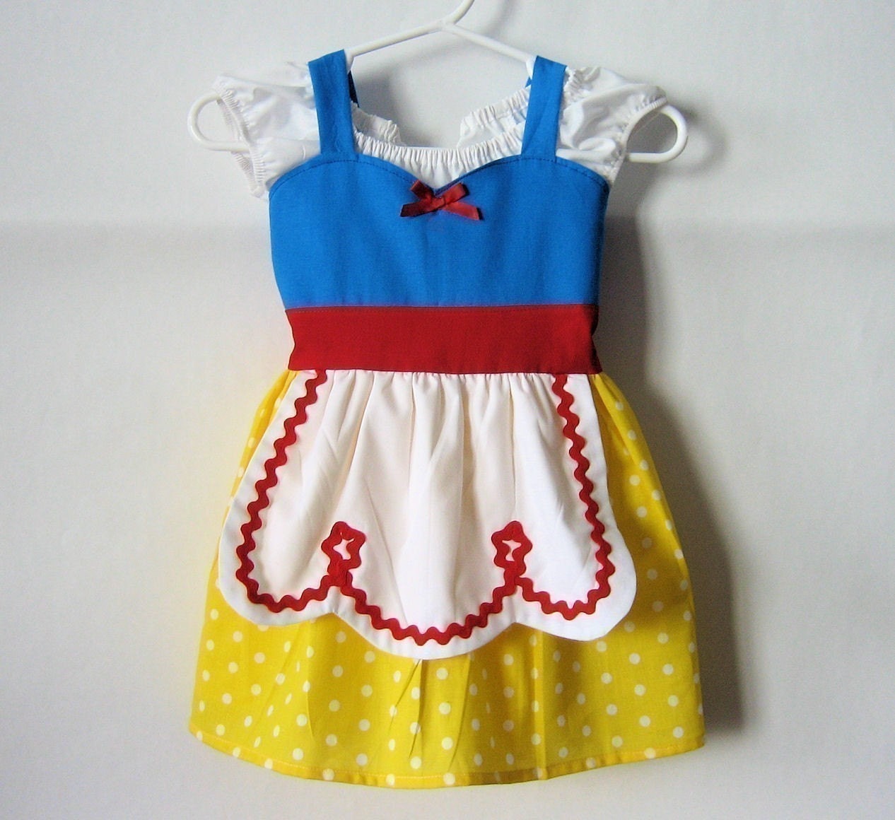
 It is said that very young children like bright, vibrant colors - reds, yellows, blues - the primary colors. The Snow White influenced dress above is meant for a cartoon character with its audience predominantly children. The use of color here is stimulating and meant to make a statement. In this case, the colors work to emphasize a child's story. These colors when worn at a formal occasion, however, will not work. Color sets a mood - the mood here is playful; in contrast to a forma affair when color selection is critical, hence, there is no room for primary colors in "a black tie affair".
 Complementary colors - blue and orange with a hint of yellow in each.


.jpg)


