Sample 1: Primary Colors Sample resembling Classic Disney's Snow White's Dress
in primary colors: red, yellow, and blue.
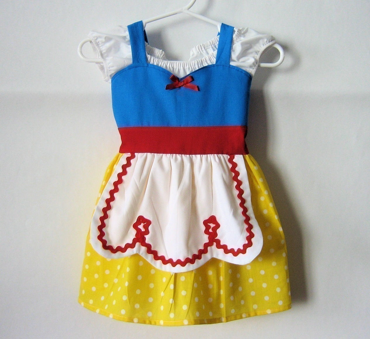
 It is said that very young children like bright, vibrant colors - reds, yellows, blues - the primary colors. The Snow White influenced dress above is meant for a cartoon character with its audience predominantly children. The use of color here is stimulating and meant to make a statement. In this case, the colors work to emphasize a child's story. These colors when worn at a formal occasion, however, will not work. Color sets a mood - the mood here is playful; in contrast to a forma affair when color selection is critical, hence, there is no room for primary colors in "a black tie affair".
2. Sample 2: Complementary Colors.
 Complementary colors - blue and orange with a hint of yellow in each.
 This contemporary fashion takes advantage of the dissonance of complementary colors to draw attention to an outfit. Blue and orange are complementary colors on the color wheel. The outfit here worn by this model on the runway has fabrics with a tint of yellow put in both the blue and the orange - the result is a better color match because both colors now share a similar color: yellow. It is said that the color wheel is objective, but color matching is subjective, hence there are always ways to make colors match better. (My clothing helper web, May 2014). https://draft.blogger.com/blogger.g?blogID=2087458614328220909#editor/target=post;postID=6461952720243305605;onPublishedMenu=allposts;onClosedMenu=allposts;postNum=0;src=post.
3. Sample 3: This is a photo of fabric from a poly-cotton t-shirt that I selected.

The colors work well here because these are close to each other on the color wheel. Blues against a dark blue background as well as close pinks,violets, and blues are analogous color schemes (also see sample 5 below). These colors are along the same spectrum and therefore work well together in this application - on a woman's shirt. If one was looking for a sharp contrast there is no one color that stands out, therefore a complementary color to add contrast might be added.
4. Sample 4. This is a photo I took of a sample of quilted fabric.

Blueish green on a brown background works well. Colors that appear in nature tend to complement each other - use of earth tones. The brown adds a contrast and helps the patterned blueish flowers pop. On the color wheel, the blueish - green forms a split complement to the brown. The colors are somewhat muted, grayed, or dull and would not work if one was looking for an object or design to come forward visually. A dash of red or yellow to stand alone would create a wild contrast in this case.
5. Analogous colors. This is a photo I took of a metallic scarf.

The shine from the light reflecting off this glossy fabric indicates the presence of metal. The light catches the hues of yellows, golds, browns, bronzes, and oranges in this scarf. Since ancient times metals have been used, namely gold and silver, as decoration in the clothing and textiles of kings, queens, leaders, nobility and people of status. (Brandon, K. , 2014, web). (http://www.textilefabric.com/site/main/articles.php?id=28) . Gold and silver in our clothing today is impractical and expensive and has been replaced in modern textiles with metallic fibers. Metallic fibers come in many colors and in this sample the colors of gold, orange, yellows, and browns form an analogous color scheme. Adjacent colors are the colors that are next to each other on the color wheel. These colors are closely related and always blend well. Autumn in Nova Scotia evokes these same colors in nature.
One application where metallic fibers might not be suitable is in baby clothing. It can tend to be rough and tough as it is often used in upholstery and on the coverings of stereo speakers.
Part 2:
Two useful resources to teach color theory for grade 7's are:
1. Classroom textbook - Clothes and Your Appearance (see reference below).
2. A web site with good teaching tricks for younger students as an introduction to color: http://www.theartofed.com/2013/01/18/3-fresh-new-ways-to-teach-about-color/.
Part 3:
Grade 7 Activities for color theory:
1. Using tempera paints or pastel crayons make a color wheel of primary, secondary, and intermediate colors.
2. Using fabric, construction paper, or paint, make a grouping of complementary color scheme, an analogous color scheme, and a monochromatic color scheme. Discuss and compare your color schemes with others.
References:
Liddell, Louise A., and Samuels, C. (2008). Clothes and Your Appearance. Tinley Park, IL.: Goodheart-Wilcox, 190-203. Print.
Metallics: (http://www.textilefabric.com/site/main/articles.php?id=28)
https://draft.blogger.com/blogger.g?blogID=2087458614328220909#editor/target=post;postID=6461952720243305605;onPublishedMenu=allposts;onClosedMenu=allposts;postNum=0;src=post (retrieved from web May, 2014, My clothing helper).
Photos in order:
1. Primary colors:
\https://img1.etsystatic.com/000/0/5293100/il_fullxfull.193002279.jpg
http://hgtv.sndimg.com/HGTV/2011/07/18/HGTV_Color-Wheel-Primary_s4x3_lg.jpg
2 .http://myclothinghelper.com/how-to-match-outfits-with-complementary-colors/
3.P. Tse photo
4. P. Tse photo
5. P. Tse photo
I love the scarf. It is very reminiscent of fall colors, with the richness of the sheen added to it. I find I am drawn to natural colors. It is hard to believe that we will soon be leaving behind the beautiful shades of summer greens and heading into the fall hues. Time sure has a way of marching on.
ReplyDeleteoh ya, I meant to speak to the princess dress, I had never thought about the primary colors being used, or why, but it makes sense, babies are often drawn towards them.
ReplyDeleteI never thought about how primary colours are more for children's garments than adult's. It would look rather "cartoonish" on an adult as you point out - almost like a clown outfit which is what your analysis made me think of! I was also thinking about how newborns are drawn to contrasts as they strengthen their sight abilities; something which primary colours definitely do and is likely why so many newborn toys/books/stuffed animals use them.
ReplyDelete